DXB402
4/8/2015 Compositional Interpretation Week 2

Contextual Information:
Artist: Edward Hopper
Title: Nighthawks
Year: 1942
Dimensions: 84 cm x 1.52 m
Collection: Art Institute of Chicago Building
Technique/Material: Oil on canvas
Style: Modernism
Image URL/Origin: https://upload.wikimedia.org/wikipedia/commons/a/a8/Nighthawks_by_Edward_Hopper_1942.jpg
Content
The image features individuals at a diner on the corner of a street late at night.
Analysis using Compositional Interpretation
The artwork uses yellow and green hues, darker colours are used outside the building to signify night, and the inside of the diner has brighter colours. The use of saturation varies from the inside of the diner being a light yellow, and the outside of the building being a much darker green. The value follows in similar suit. There is a colour contrast between the inside of the diner, most significantly the yellow walls and timber and the outside dark, brown and green night. The diner is on a street corner and uses perspective relative to the point of view of the viewer, objects such as the bar stools differ in size comparatively to how far away they are. The florescent lighting draw the eye to the diner, and create a focal point for the image. The outside of the building also draw the eye through the use of the linear lines. The two men wear dark clothes, the woman is in red, creating another focus area. The lines of the building (as previously discussed) shadows, and eye lines draw the viewer back to this area. The atmosphere of this painting is lonely, a congregation of individuals all in a group yet alone in their own thoughts.

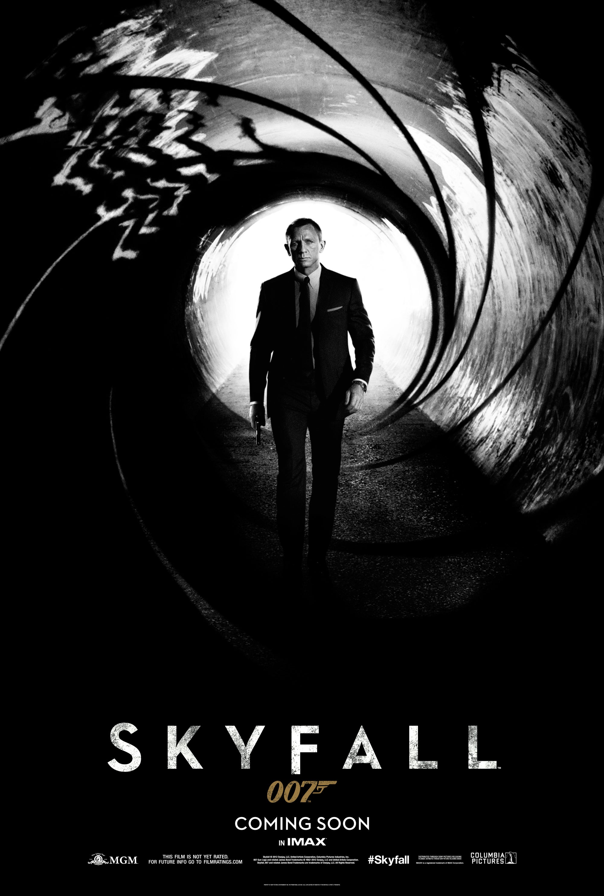
Contextual Information:
Artist: Artist unknown- property of MGM
Title: Skyfall Poster
Year: 2012
Dimensions: 2000px x 2963px (can be printed at various sizes)
Collection: Property of MGM
Technique/Material: Digital manipulation
Style: Film Poster
Image URL/Origin: http://www.007.com/wp-content/uploads/2012/05/SKY_DIGI_ONLN_TSR_1SHT_1_0514_RGB_300_1.jpg
Content
The image features a mysterious individual from the viewpoint of the chamber of a pistol.
Analysis using Compositional Interpretation
The movie poster is predominately black and white except for the title of the film. Approximately fifty shades of grey can be seen as the image has very low saturation. The darker colours have low values. As the image is down the chamber of a gun, size is relative to the perspective of the poster. The contrast between the black gun chamber and white background creates a focal point on the image. This contrast also creates atmospheric perspective (in conjunction with the barrel of the gun). The curvature of the barrel also centralises the image to the dark image of the man. After the eye is drawn to the figure, his stance pushes the viewers eyesight down his arms into the black, where it features the only colour area, the title and gold branding for the film. The atmosphere for the poster is cold due to the content of the lethal weapon and black and white nature.
Comparison & Lessons Learnt
Both the images have cold, empty, even ominous feelings yet in terms of colours are visual different. Hopper has been able to articulate his feelings through dark colours, absences of space (such as the large street) and the dark coloured man. The James Bond poster is still very effective but much more obvious in its effort to make it feel mechanical. Both adapt examples of colour and monochromatic imagery.

Contextual Information:
Director: Quentin Tarantino
Title: Django Unchained
Year: 2012
Runtime: 2h 45m
Collection: Weinstein Company
Technique/Material: Film
Image URL/Origin: Sourced from original copy
Content
“With the help of a German bounty hunter, a freed slave sets out to rescue his wife from a brutal Mississippi plantation owner.” Sourced from IMDB. (IMDB, 2014, Django Unchained. http://www.imdb.com/title/tt1853728/ (05/08/2015)
Analysis using Compositional Interpretation & Monaco’s Syntax
Django Unchained is filmed in the screen ratio 2.35 : 1, the wider ratio accounts for more background image, therefore compared to older films mainly shot in 1.33 : 1, there must be more engineered into each shot to guide the audience to a focal point. The director used linear shapes of the characters and camera techniques to achieve this. By using a close up shot and blurring the depth of focus, the director masks the background and shifts interest of the viewer, known as overlapping on the depth plane. The scene uses open screen frames where through the characters eyesight and direction of their body and weapon the viewer is drawn outside the frame and is expecting action, developing interest in the ensuing scene. The movement of the character across the screen and frame plane are further developed by the stance of the character. His leaning linear pose draws the viewer up his body before being directed to his eyesight and then across the frame. The lighting of his leg creates this line and contrasts it with the much lower value darker hue in the background. There is a jump cut to the next scene where the lighting and shadowing of the characters clothing create the central focal point, which is further enforced by the change of depth. The blurred background further places the focus on the character and then gun. Furthermore the shape contrast between the characters shoulders and features in juxtaposed with the cylinder shape of the guns barrel.
12/08/2015 Semiotics Week 3

Contextual Information:
Artist: Artist unknown
Title: Smoking Featured
Year: 2014
Dimensions: Digital image NA
Technique/Material: Digital manipulation
Style: Advertisement
Image URL/Origin: http://i1.wp.com/antikleidi.com/wp-content/uploads/2014/06/smoking.featured.jpg
Content
The advertisement depicts a young girl blowing bubbles, however the bubbles are replaced with smoke rings. The image is black and white.
Analysis
The advertisement has underlying connotative meaning. The black and white colouring symbolises the bleak future for the child. The saturated dark background is used to foreground and emphasise the smoke rings. The girls posture and arm direct the line of sight upwards, angled at the rings of smoke. The tagline text anchors the context of the image, explaining the harmful flow on effects of smoking. The loss of innocence is strongly symbolised through the usual child hood, happy act of blowing bubbles, which is theorised by Pierce. The black and white colouring further juxtaposes the image of happiness. The text and phrasing interact with the viewer by emotional short sentences that are direct. By engaging the reader like this, the viewer is positioned to act as a role model for the impressionable child. The meaning is moved across the image by having the girl positioned to the left of the advertisement and the smoke going into the black, ominous future.
| Paradigms | |||
| Syntagms | Girl | Becomes in the future | A smoker |

Contextual Information:
Artist: The Marlboro Company – artist unknown
Title: Paul Hornung for Marlboro Cigarettes
Year: 1962
Dimensions: Originally full page print for print media
Technique/Material: Photography and Illustration
Style: Advertisement
Image URL/Origin: http://171.67.24.121/tobacco_web/images/tobacco_ads/smoking_in_sports/football/large/football_05.jpg
Content
The advertisement depicts a male smoking in a relaxed position against a locker.
Analysis
The strong red hue in the brand name, box of cigarettes and shirt of the man draw the viewer around the image. The colour contrast of the saturated pants and lockers further emphasise the packaging of the product and creates a focus on the male. The text on the horizon line depicts the male as a desirable figure that someone should live up to be. This undoubtedly is being used to associate the idea of desirability to smoking. The males posture, relaxed attitude and top text further enforce the ‘coolness’ of the character. Each aspect of the photo creates focal lines to move the reader around the image, see the hand, packaging colour red, arm, and direction of the cigarette. The camera shoots up to symbolise his status and head tilted upwards suggests he is looking towards the future and implies his success. The location is similar to that of a high school as the character is wearing a varsity jacket, popular among young people during the era this advertisement is from. He is also leaning against a locker, similar to a stereotypical American school. Following this stereotype a valuable sports player is often referred to as popular and looked upon like a role model by a school’s administration. This further substantiates the symbolism that Marlboro is associating with their product. The image has connotative meaning and also draws on Gestault theory of special proximity with the image being read as a whole.
Comparison and Lessons Learnt
Smoking and its practise have dramatically changed over the past seventy years. The health risks have subsequently changed the way we market the products and here are two prime examples of that change. The semiotics in both images draw comparison in the way they use signs to further develop their message. A very valid and successful form of advertising which is apparent in the ads being released more than fifty years apart.
25/08/2015 Visual Semiotics Week 5

Contextual Information:
Artist: Kelloggs Company – artist unknown
Title: Corn Flakes “The best to you each morning” Campaign
Year: 1962
Dimensions: Originally full page print for print media
Technique/Material: Illustration
Style: Advertisement
Image URL/Origin: https://pbs.twimg.com/media/CFN3Rg-XIAAbOQZ.jpg
Content
This advertisement depicts a father and child eating cereal at the table.
Analysis
The narrative that takes place is transactive between the father and son. The representational design is used to portray the father teaching his son life skills such as eating healthily, this is further anchored by the text. Kelloggs is associating their cereal as the ‘right thing to do’ by your child and therefore is depicting this iconic moment of fatherhood. The contact between the figures and viewers is demanding with the fathers head looking down on the child, this also demonstrates the symbolic power of the scene. Although the people are side-on, the fathers turned body reattaches the viewer to the scene. The information is valued from top to bottom, with the higher section being the ideal (father, son, bonding, mentoring), and the bottom being the real (the cereal). This advertisement is framed by its similar colours. The connection between the red of the background, father’s shirt, Kelloggs logo and the light brown table and background colour further substantiates the visual relationship and salient elements of the scene. The advertisement also has high natural modality, which may not always be as effective then familiarity with icons and perceptual cues however the well known childhood scene is quickly recognisable for the majority of the intended audience.

Contextual Information:
Artist: Tipalet Company – artist unknown
Title: Tipalet Cherry Promotion
Year: 1969
Dimensions: Originally full page print for print media
Technique/Material: Photography & Illustration
Style: Advertisement
Image URL/Origin: https://thewindowonthestreet.files.wordpress.com/2015/07/sexist-ad-1.jpg
Content
The advertisement depicts a man blowing smoke into a woman’s face.
Analysis
The representational analysis of this image shows a narrative that has a significant power imbalance and gender roles that have been stereotyped (compared to modern gender roles). Anchored by the tagline across the advertisement, the brand states that by smoking their cigarettes you will be more appealing to the opposite sex. The advertisement is transactive with the male figure expecting an appropriate reaction to his action. The male has a higher position on the page and his point of view is downwards, symbolising power. The woman is gazing upwards and leaning forward continuing the previous notion and establishing a bidirectional relationship however very much one sided. Their bodies are close together and the image is framed as a close up angle, evoking an intimate encounter. The male’s head is positioned on a side angle, while more of the females face can be seen. Therefore the audience is more attached to the female and to the offer that she will desire you if you buy their product. Kress and van Leewens’s visual grammar (1) also is apparent in this advertisement (see annotations). Focal lines with the smoke, cigarette and product information is supported by Gestault’s Z theory and principles of design (1). The cigarette is pointed towards the females breasts which further substantiates the sexualisation of the women and the power imbalance. As sexual desire is primal, the high natural modality allows the women to be easily recognisable.
(1) O’Neill, Shaleph, (2008). Chapter 5 : Semiotic Theory : Signs and Signification. In O’Neill, Shaleph, Interactive media : the semiotics of embodied interaction, (pp.67 – 82). London : Springer.
Comparison and Lessons Learnt
The way in which positive and negative visual imagery is portrayed by these two advertisements is very powerful. The entire mood of the piece can change quite dramatically depending on the relationship between the characters. A father son relationship with the dad being above the son is rightfully interpreted as loving and guiding. Where as the Tipalet relationship and sexualised comments is rightfully unacceptable by todays standards.
