DXB402
Uncategorized
VISUAL SOCIAL SEMIOTICS (Image Analysis – WK5)
Student name: Savanah Waters
Date of post: 28/08/15
Topic + Lecture Week: Visual Social Semiotics Analysis and Image Annotation, WK5

Image: House of Cards Poster
Title: House of Cards
Year Created: 2013
Dimensions: 1000 x 1289
Technique/Material: TV show
Genre: Drama
Content: This poster was one of the first released so there is a lot of pressure to get the point of the show across to the viewer. This poster perfectly captures the shows atmosphere in one image. Kevin Spacey’s Character sits on Lincoln’s statue chair with bloody hands.
Analysis using Visual Social Semiotics:
Representational Narrative:
As there is only the one character in this image the only interaction is between Frank Underwood and the viewer. He is looking down on you, with bloody hands as if he has just clawed his way to the top. He is looking directly into the camera, breaking the fourth wall and personally involving the viewer. He does this throughout the show also, sometimes even talking to the audience as if we are there with him.
Conceptual Representation:
The chair Frank is regally sitting upon is easily recognised as Lincoln’s statue. An iconic image that is immediately associated with presidency. The American flag contributes to the patriotic feel of the image. The edges of the image are shadowed out with the lighting focus on Mr. Underwood on Lincoln’s chair.
Interactive Meaning of Contact, Distance & Point of View:
Spacey’s character is making symbolic eye contact with the viewer. The image is taken at a medium shot, you can clearly see his face but his full body is in the shot. Taken from an angle that makes the viewer feel as if they are sitting at Frank Underwood’s feet. The image has high natural modality.
VISUAL SOCIAL SEMIOTICS (IMAGE ANALYSIS)
Student name: Siyu Gong
Date of post: 27/08/2015
Topic and relevant lecture week: annotate image & social semiotics analysis, week 5 lecture

Contextual information :
Type: Selfie
Photo by: Siyu Gong
Year of creation: 2015
Collection/source: Personal
Technique: Photograph
Style: Realism
Content: This is my personal selfie, in the photograph I was wearing a jujitsu clothing and make a pose that represent power also with a smile.
Analysis using visual social semiotics
Representational-Narrative:
The photo just show myself, no interaction with someone else, so this can be called nontransactive.
Representational- Conceptual:
Conceptual structures – more generalized, stable,
timeless. Define this image through iconography and visual emphasis. For example, the lighting is irradiated with indoor lighting on my face, the photo with low value and the character look out of the place.
Interactive meaning- Contact:
Demands: The character make a symbolic demand on viewer, she look up at the viewer and make a static action that represent power, there is imaginary contact with the person in the photo.
Interactive meaning- Distance:
Medium shot- cut off at waist, knee
Interactive meaning- Point of view:
The viewer perspective of the screen is Frontal Angel. The character is look up at the viewer.
Compositional- Modality:
This image shows a high natural modality.
VISUAL SOCIAL SEMIOTICS (IMAGE ANALYSIS)
Student name: Siyu Gong
Date of post: 27/08/2015
Topic and relevant lecture week: annotate image & social semiotics analysis, week 5 lecture

Contextual information :
Title: Hiroshima mon amour
Type: Romantic comedy-drama film
Directed by: Alain Resnais
Year of creation: 1959
Collection/source: one frames in the movie
Technique: Filming
Style: Realism
Image URL / origin: http://dailybruin.com/2014/10/16/hiroshima-mon-amour-still-a-classic-innovative-film/
Content: Two people in the “Hiroshima Mon Amour” – one a French movie actress (Emmanuelle Riva) and the other a Japanese architect (Eiji Okada) – embroiled in a steamy affair in a Hiroshima still reeling from the atom bomb.
This screen shows a exotic couple, the man put his lover’s face in his hand and look at her tenderly. However, the women showed a sadness expression on her face.
Analysis using visual social semiotics
Representational-Narrative:
This image is telling a story, there have something happening between this two characters, so it is Narrative. Moreover, the man put his lover’s face in his hand and look at her, so it belong Transactive. There also have reaction on the image, it shown by their eyes line.
Representational- Conceptual:
- Conceptual structures – more generalized, stable,
timeless. Define this image through iconography and visual emphasis. For example, the lighting is irradiated with natural light on two protagonists’ face, the man put his lover’s face in his hand and look at her, conventionally associate with something and show the black and white screen. - classification structure- typically symmetrically distributed
Interactive meaning- Contact:
Demands: The characters did not make a symbolic demand on viewer, the man is looking at the woman and the woman is looking out of the screen.
Interactive meaning- Distance:
Close up (head and shoulders or less), the characters touch each other.
Interactive meaning- Point of view:
The viewer perspective of the screen is horizontal angle.
The man’s view is oblique angle, because he is looking at the woman
Compositional- Modality:
This image shows a high natural modality.
SEMIOTICS (Image Analysis – WK3)
Student name: Savanah Waters
Date of post: 27/08/15
Topic + Lecture Week: Semiotics Analysis and Image Annotation, WK3

Image: Save The Rhino Campaign
Title: Nothing We do Will Ever Bring Them Back
Dimensions: 880 x 622
Technique/Material: Photograph, computer edited
Photographer: Maartje Jaquet
Genre: Motivational Save The Rhino Advertisement
Image URL Origin: http://www.wabbaly.com/campaigns-that-build-environmental-awareness/
Content: Save The Rhino Campaign to shine a light on the serious endangerment of the Rhino. The slogan of the campaign being “Nothing we do will ever bring them back”, showcasing different animals with strap-on Rhino horns computer edited onto their heads.
Semiotic Analysis:
Sign: The signified aspect of the image is the Rhino horn strap-on mask and the signifier being the Zebra who is clearly not a Rhino.
Icon: The icon of the image is the Rhino horn, it obviously belongs elsewhere and is strapped onto the Zebra.
Symbol: The Save The Rhino Symbol tells the viewer who the organisation is behind the campaign.
Anchorage: The text in the bottom corner, however small creates a big impact. The truth behind the words with the contrast of the out of place horn really makes the viewer think about a world without Rhino’s. A sad, but very rapidly approaching world. The text helps push the viewer to the correct interpretation of the image.
SEMIOTICS (Image Analysis – WK3)
Student name: Savanah Waters
Date of post: 27/08/15
Topic + Lecture Week: Semiotics Analysis and Image Annotation, WK3

Image: WWF Leopard Skin Jacket
Title: Sewing Pattern
Dimensions: 880 x 629
Technique/Material: Photograph with image overlay
Genre: Motivational WWF Advertisement
Image URL Origin: http://www.technocrazed.com/20-most-striking-wwf-posters-that-will-motivate-you-to-fight-for-the-planet
Content: WWF Poster to gain support towards the “fight against illegal hunting” by creating awareness of the products made from endangered and protected species. The image shows a beautiful leopard in its habitat with a sewing pattern overlaying the image.
Semiotic Analysis:
Sign: The signified aspect of the image is the sewing pattern outline and the signifier is the blissfully ignorant, endangered leopard.
Icon: The iconic facet of the advertisement is the sewing pattern itself. The viewer is first aware of the leopard and then is quickly conscious of the jacket pattern on top of the animal. The pattern is an icon in a very Cruella De Vil manner.
Symbol: WWF is a widely recognised symbol for animal wellbeing and animal activism.
Anchorage: The text in the image is sort of a secondary anchorage, the main being the sewing pattern. The pattern directs the viewer straight to the point and focus of the image. Then afterwards the viewer will read the text gaining a greater understanding of the advertisement’s specific purpose.
Compositional Interpretation & Monaco’s Syntax (Image Sequence)
Student name: Savanah Waters
Date of post: 27/08/15
Topic + Lecture Week: CI Analysis and Moving Image Annotation Monaco’s Syntax, WK2

Image: 5 frames from Bronson: Tea Scene
Title: Bronson
Year Created: 2008
Dimensions: 1.78:1
Director: Nicolas Winding Refn
Technique/Material: Movie
Genre: Brechtian Style Film
Content: Bronson is a film loosely based around Britain’s most notorious prisoner Charles Salvador (Charles Bronson). The film itself is fantastically witty and is constantly using interesting angles and Brechtian theatre techniques. In the chosen scene Bronson is in prison and is serving tea to the guard and another inmate. The scene has no background music.
Analysis using Compositional Interpretation & Monaco’s Syntax:
Colour Analysis: The scene has an overall blue hue to it, apart from the few small uses of yellow and white on Bronson himself, the background objects and the hazard tape. The scene uses incredibly vivid colours that are highly saturated with high values.
Form/Shape: In the first two frames the structure of the scene is very rectangular, almost framed in a way. Bronson uses a lot of strong, angular hand and arm gestures during the scene.
Light: The scene taking place is in a prison with bright neon lights, and no natural lighting. The scene gives off an uncomfortably unnaturally bright atmosphere.
Monaco’s Syntax: The scene has two distinct camera angles, the first being long focus showcasing the entire setting. The second being short focus, from Bronson’s point of view or simply a short focus shot. The POV shot’s make the viewer feel immersed in the scene as if they are personally involved in the story. Very few words are spoken in the scene with no music, this creates an extraordinarily bare and almost awkward atmosphere.
SEMIOTICS (IMAGE ANALYSIS)
Student name: Siyu Gong
Date of post: 27/08/2015
Topic and relevant lecture week: annotate image & semiotics analysis, week 3 lecture

Contextual information :
Type: Advertising
Photograph by: Sid Lee
Title: Trims The Fat in Burger King’s
Year of creation: 2013
Collection/source: Burger King’s Creative Advertising
Technique: Photograph & Photoshop
Image URL /origin: http://www.thetorontoegotist.com/news/local/2013/october/9/sid-lee-trims-fat-burger-kings-new-gratifries-ad
Content: This ad of Burger King used their fries represent a saw, beside the image they note that “We’ve trimmed the fat”. this text and fries saw can make customer easily understand the intention of this ad.
Sign: The signified of this ad is a fries, the signifier is a saw and use it can cut something.
Icon- Icon is direct representation through apparent likeness. This ad obviously show the classic logo of Burger King, and put their product under the ad in order to make the customer easy to realize this is Burger King’s ad.
Symbol- The symbol in the ad are Burger King’s logo and also the symbol text beside their product.
Relay/Anchorage- The text in this ad have a relationship with the Burger King’s fries. The text of this ad is anchoring the meaning, it focus and direct lead viewer the way they interpret the image. After people saw this text, they will combined the image of the fries saw then they will understand eat this fries can not get fat easily. This combination of images and text is the easiest way to let audience understand what Burger King wanted to express.
Moreover, the focal point of this ad is the big red text, also use colour contrast(red text and white backgroud) in order to attract peoples’ eyes.
Compositional Interpretation (Image Analysis – WK2)
Student name: Savanah Waters
Date of post: 27/08/15
Topic + Lecture Week: CI Analysis and Image Annotation, WK2

Image: Chase & Sanborn Coffee Advertisement
Title: “If your husband ever finds out”
Year Created: 1950
Dimensions: n/a original dimensions unknown
Source: NY Daily News
Technique/Material: Photograph advertisement
Genre: 50’s Ad
Image URL Origin: http://www.nydailynews.com/entertainment/tv/sexist-ads-mad-men-era-gallery-1.1050013?pmSlide=1.1050009
Content: 1950’s sexist advertisement for Chase & Sanborn Coffee. The image shows a husband with his arm raised, about to strike his wife on her buttocks. Suggesting that husband is so very angry about his wife not “store-testing for fresher coffee” and that Chase & Sanborn is the answer.
Analysis using Compositional Interpretation:
Colour Analysis: This advertisement has Yellow hue and uses a sepia colour pallet. The tone is a result of the images age, the original advertisement was published in black and white. The image has a low saturation. The background of the advert has a high value, while the rest of the image has a very low value. This creates a noticeable contrast.
Spatial Organization: The Man and Woman take centre stage on the chair. They are the only elements in this image, apart from the typography and coffee canister. There is no background image or horizon line used in the advert. The image is spaced in thirds, the woman and the coffee canister are the focus of the bottom third. The woman’s eye level is almost on par with the coffee canister, while the man is in the middle third looking down at the woman mid strike. The woman’s flailing legs are in the middle section along with the man and writing. The man’s raised arm and the image header takes up the top third of the image.
Light: The scene is not specifically inside or outside, so there is no natural lighting specified. There is very slight lighting on the woman’s legs and hair, but the rest of her body and the chair are shadowed because of the man’s body.
Expressive Content: This advertisement shocked me. For someone living in the 21st century, an image like this seems so ridiculous it must be a joke of some kind. The woman even has a smile on her face and her leg kicked up as if she’s about to be kissed lovingly. I really can’t help but laugh when I see this image, while praying that the woman who posed for this advertisement is regretting some of her life decisions. This image to me expresses more than anything, the role that women played in the 50’s.
Compositional Interpretation (Image Analysis – WK2)
Student name: Savanah Waters
Date of post: 27/08/15
Topic + Lecture Week: CI Analysis and Image Annotation, WK2
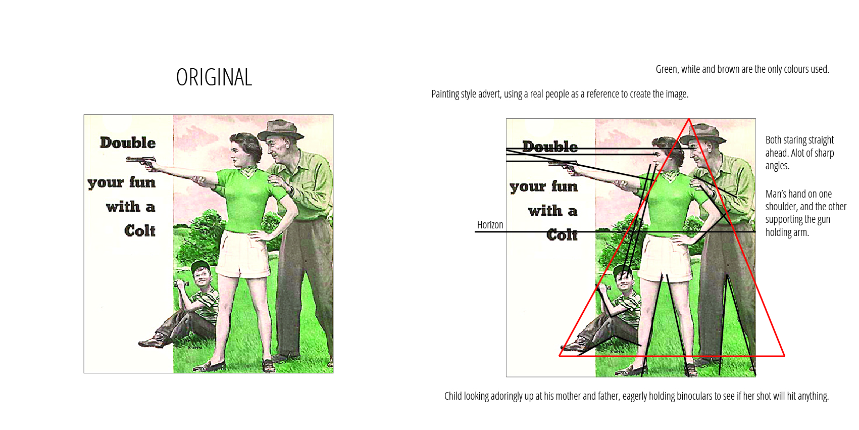
Image: Colt Advertisement
Title: Colt Match Target Woodsman Pistol
Year Created: 1951
Dimensions: 150mm x 150mm
Source: Huffington Post Blog Post “Vintage Gun Ads”
Technique/Material: Photograph style painting advertisement
Genre: 50’s Ad
Image URL Origin: http://www.huffingtonpost.com.au/2012/12/20/23-vintage-gun-ads-featur_n_2339449.html?ir=Australia
Content: 1951 advert for Colt, depicting the gun as family friendly but more importantly women friendly.
Analysis using Compositional Interpretation:
Colour Analysis: The whole image has a Green/Yellow Hue. The only colours used in the image are green, white and a range of yellows and browns. In the original image perhaps the darker colours were blacks and greys but in the version of the image the darker colours are various tones of brown. The image, like many other created in that era uses predominantly pastel colours and has low saturation. This makes the image appear softer and helps the photograph style painting look more realistic.
Spatial Organization: The words “Double your fun with a Colt” are on a white background on one third of the image. The Colt itself is also highlighted in this white background space. The little boy’s shoes overlap onto it as well, effectively tying the image into the white space. The family are situated in a triangle shape. The viewer is first drawn to the Colt, and then to the Man and Woman and then finally to the boy.
Light: The scene takes place on a bright sunny day, the artist uses a natural style daylight to create slight shadows and add to the realism of the image. The most noticeable shadow being on the Woman’s gun holding arm and the Man’s supporting hand.
Expressive Content: The scene is expressing a happy, all American family on an exciting day out with the Colt. The image manages to successfully make a gun look like a fun, loving family activity.
