Compositional Interpretation (Image Analysis – WK2)

Student name: Savanah Waters

Date of post: 27/08/15

Topic + Lecture Week: CI Analysis and Image Annotation, WK2


compositional_interp_1-01


Image: Colt Advertisement

Title: Colt Match Target Woodsman Pistol
Year Created: 1951
Dimensions: 150mm x 150mm
Source: Huffington Post Blog Post “Vintage Gun Ads”
Technique/Material: Photograph style painting advertisement
Genre: 50’s Ad
Image URL Origin: http://www.huffingtonpost.com.au/2012/12/20/23-vintage-gun-ads-featur_n_2339449.html?ir=Australia

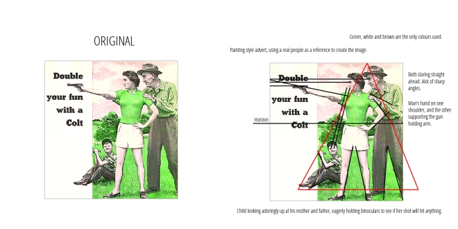
Content: 1951 advert for Colt, depicting the gun as family friendly but more importantly women friendly.

Analysis using Compositional Interpretation:

Colour Analysis: The whole image has a Green/Yellow Hue. The only colours used in the image are green, white and a range of yellows and browns. In the original image perhaps the darker colours were blacks and greys but in the version of the image the darker colours are various tones of brown. The image, like many other created in that era uses predominantly pastel colours and has low saturation. This makes the image appear softer and helps the photograph style painting look more realistic.

Spatial Organization: The words “Double your fun with a Colt” are on a white background on one third of the image. The Colt itself is also highlighted in this white background space. The little boy’s shoes overlap onto it as well, effectively tying the image into the white space. The family are situated in a triangle shape. The viewer is first drawn to the Colt, and then to the Man and Woman and then finally to the boy.

Light: The scene takes place on a bright sunny day, the artist uses a natural style daylight to create slight shadows and add to the realism of the image. The most noticeable shadow being on the Woman’s gun holding arm and the Man’s supporting hand.

Expressive Content: The scene is expressing a happy, all American family on an exciting day out with the Colt. The image manages to successfully make a gun look like a fun, loving family activity.


Compositional Interpretation (Image Analysis – WK2)

Semiotics (Advertisement Analysis – WK3)

Student Name: Jess Vandersande

Date of post: 27/08/15

Topic + Lecture Week: Semiotics (Advertisement Analysis) WK3


Amnesty-International-Domestic-Abuse-ad-1-600x848

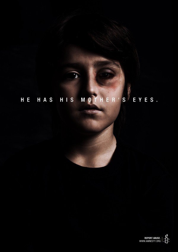
BRUISES_BOY

Image One – Contextual Information:

Artist  – unknown (Amnesty International)
Type – Awareness Campaign ad
Title – He Has His Mother’s Eyes (Report Abuse)
Year of Creation – 2015
Collection/source – Amnesty International 
Medium/Technique – Digitally altered photograph
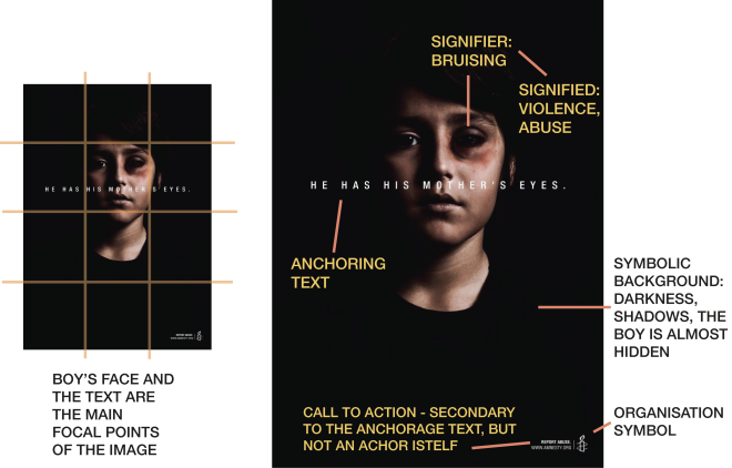
Content – A young boy with bruises on his face is pictured behind the text ‘he has his mother’s eyes’. The image is extremely dark, with only the boy’s face and the overlaying text visible against the black surroundings.

Semiotic Analysis:

In this campaign advertisement, the predominance of the dark background creates a focal point on the image of the youthful boy in the centre. The viewer’s eye is drawn immediately to the boy’s black eye. The predominance of the bruising is a signifier to violence and abuse, a conclusion which is further unpacked as the focal lines draw the viewer’s gaze across the image via the overlaying text. The phrase ‘he has his mother’s eyes’ provides anchorage to the signified abuse, and presents a further symbolic interpretation of the bruising. It is an index of his own abuse, and a symbol that of his mother’s. The text used is a phrase that culturally is used to describe families that share characteristics, usually in a positive light. However, the direct interaction between the two elements changes the meaning of both the text and the image. The relationship between the text and the image is now symbolic, as two completely different signifiers have been combined to present a culturally-specific meaning.
The dark, shadow-like background can also be seen as a signifier with many possible signified elements, such as the boy almost fading unseen into the shadows, or simply symbolising the seriousness of the situation presented.
At the bottom of the image, there is the tagline ‘stop abuse‘ next to the Amnesty International logo. This text is not an anchor, but rather a transfer of meaning to a ‘call for action’ to stop the cycle.

Image Two – Contextual Information:

porcelaingirl

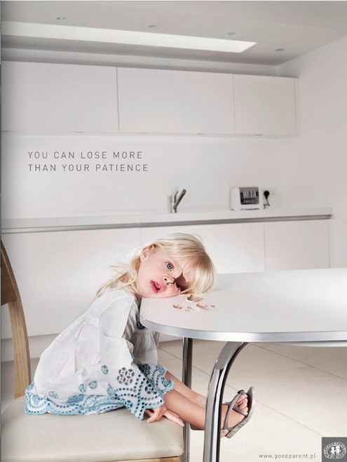
PORCELAIN CHILD
Artist  – unknown (Nobody’s Children)
Type – Awareness Campaign ad
Title – You Can Lose More Than Your Patience
Year of Creation – 2015
Collection/source – Nobody’s Children Foundation Campaign
Medium/Technique – Digitally altered photograph
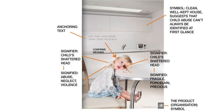
Content – A young girl rests her head on the table, expressionless, almost as if she was dead. Her head has been cracked into pieces, as if she was made of china or porcelain. The room around her is clean and brightly lit, and the image itself is, at first glance, deceptive in its nature. The text ‘you may lose more than your patience’ is placed above the girl.

Semiotic Analysis:

The light backgrounds of these images is a different representation of abuse, as upon first glance, the image itself is bright and welcoming until the eye is drawn to the image of the little girl at the table. Her head is cracked against the glass, almost as if her skin was made of porcelain. The injury itself is a index of the violence (or perhaps extreme neglect) that has been committed against the child. The signified abuse is layered with another level of meaning in the way in which her skin has been depicted; shattered porcelain, representative of the fragility of a child in the way that just as porcelain will crack or shatter if handled with too much force, so might the life of a child.

The tonality of the image is bright and inviting, with the deceptive use of warm tones and the clean realism of the image. The child herself is dressed neatly. This in itself is a symbol of how abuse cannot always been seen at first glance, and once realised, is often too late.

The phrase ‘You may lose more than your patience’ is an anchorage to the signified violence and symbolised fragility of a child. It relays the meaning of the image, confirming that this was definitely an act of violence, and not an accident.


Comparative Study:

In comparison, both advertisements have taken a difference route in portraying the same message (a call for action to stop child abuse). The first image utilises dark, serious tones, and the brutality of the child’s injury is the first thing that is seen. This image makes use of the cultural understanding of ‘he has his mother’s eyes’ and extends it to include the cycle of abuse within families. In comparison, the second advertisement is a more subtle relay of information, with the bright, unsuspecting image that surrounds the broken child insisting upon a more hidden form of abuse, one that stems from a parent’s neglect or misplaced frustration. The first image focuses on the brutality of the abuse itself, whilst the second image re-enforces the fragility of a child.

Semiotics (Advertisement Analysis – WK3)

Social Semiotics (Analysis – WK5)

Student Name: Jess Vandersande n9168214

Date of post: 27/08/15

Topic + Lecture Week: Social Semiotics (Image Analysis) WK5


Image One – Contextual Information:

tumblr_n6jjybNqlA1r1rfmmo1_400
WOMAN
Artist  –  Anastasia Mill
Type – Selfie
Title – Anastasia Mill
Year of Creation – 2015
Collection/source –
Medium/Technique – Photograph
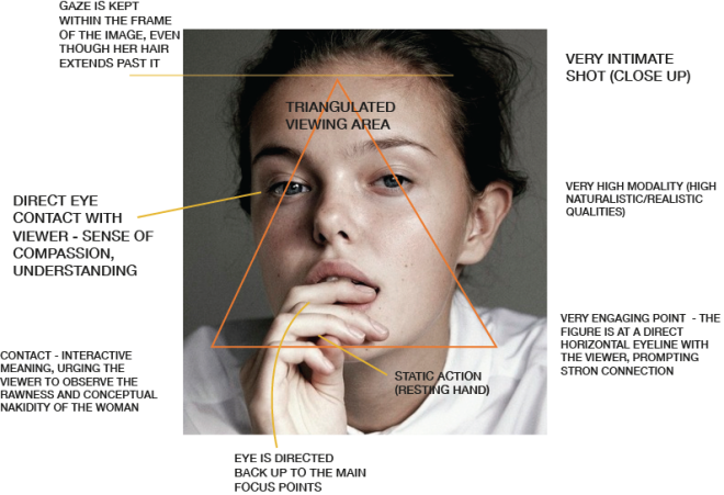
Content – Simple portrait of a woman staring directly into the camera, her fingers resting at her mouth. She has no makeup on, is wearing a simple white shirt and her hair is tied messily behind her; this is a very raw, unchanged image.

Social Semiotic Analysis:
This is an intimate self portrait of a woman staring directly into the camera, holding a strong but inviting contact with the viewer. The salience of this image is her eyes, and as the eye is guided first down to her hand and across her shoulders, it is directed again back to her focal gaze. Even though the colour palette of this image is fairly earthy and neutral, the strong contrast between the darker background and the brighter glow of the woman’s skin holds strong visual focus which creates a strong foreground/background definition.
The static image is one of high modality. The closeness of the image represents the woman as a friend, whilst presenting her raw connection with the viewer, which is the main interaction of the photo.

Image Two – Contextual Information:

embrace-sketch-web-_o
alone togeether

Artist – Maria Kreyn
Title – Alone Together
Year of creation – 2012
Dimensions – 20 x 11 inches
Collection/source – Maria Kreyn Online Portfolio
Medium –  oil on canvas
Style – Realism
Image URL / origin – http://mariakreyn.com/

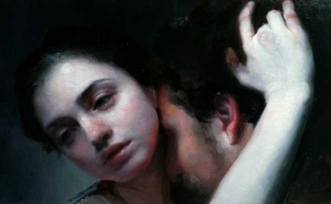
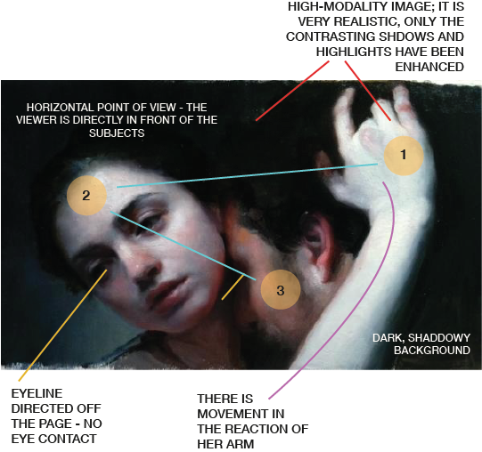
Content – A woman and a man embracing; the woman’s hand is resting on the man’s head, but in a somewhat reluctant fashion. Her gaze is somewhere between saddened and reluctance, and looks beyond the constraints of the painting. The figures are shrouded in shadows, with a strong luminance of skin tone on the woman, and darker shades on the man.


Social Semiotic Analysis:
The painting depicts the embrace of two figures, assumably lovers from their closeness. The image is at an intimate distance, with only their faces and the woman’s arm visible within the frame. Immediately, it can be seen that this is a social interaction with greatly strained tones, which is symbolised throughout the woman’s expression, her line of sight and the hesitance with which she embraces him. The painting is non-transactive, as there is no eye contact with the viewer (the woman’s gaze is directed down past the confines of the painting, away from the viewer and the man). The narrative can be found in the way the woman is reaction to the embrace, as if she feels no emotional connection to the man. The title of the painting, Alone Together, plays a large part in confirming the interpretation of this scene.
The highlights on the woman’s face and arm command the majority of the salience of the scene, as the viewer’s eye is caught first by her arm, travelling back across the image to her face, and finally, to the side of the man’s face that is slightly more hidden. Her body language and the tonal composition of this image tell the story of loneliness; the background of the image contributes strongly to a feeling of isolation, with its utilisation of dark, shadowed elements. The tonal contrast between the background and highlighted foreground figures enhances them as the focal points.

Comparative Analysis:
In comparison, both images have a strength within their compositional tones and contrasts, however, the first image is a definite action of invitation, whilst the second image is a reaction to a feeling and a social happening. The self portrait is composed in such a way that the confidence of the woman is enhanced whilst still retaining its inviting, friendly nature. The lovers, in contrast, are a much colder social depiction of a lack of comfort or an unwillingness to be in the present situation. In the first image, the viewer is made to almost feel like a participation in the interaction, whilst reduced to a purely witnessing viewpoint in the second image.
Social Semiotics (Analysis – WK5)

Compositional Interpretation (Image Analysis) WK2

Student Name: Jess Vandersande n9168214

Date of post: 27/08/15

Topic + Lecture Week: CI Analysis and Image Annotation, WK2


IMAGE ONE

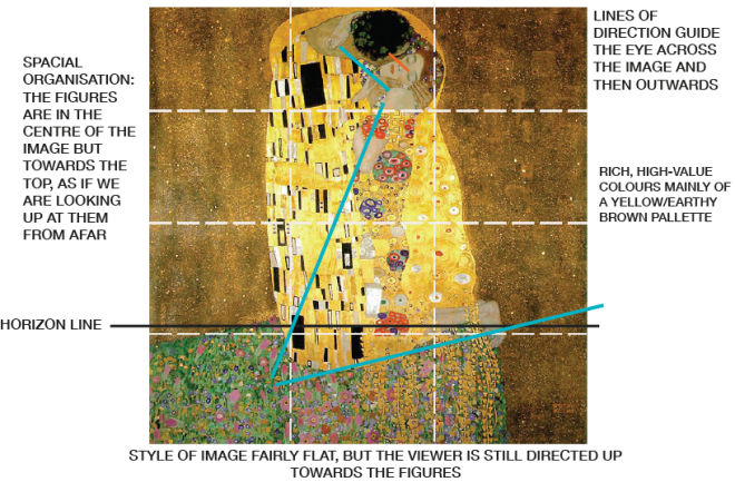
klimt-der-kuss-1908

THE KISS

Contextual Information:

Artist – Gustav Klimt
Title – The Kiss
Year of creation -1909
Dimensions – 180 x 180cm
Collection/source
Medium – oil on canvas
Genre – Fantastical Portrait
Style – Art Nouveau
Image URL / origin – http://www.klimt.com/en/gallery/women.html

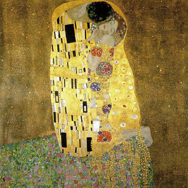
Content – A couple locked in intimacy, embracing in a field of flowers.


Compositional Interpretation Analisys:

Very high saturation of a yellow hue. Warm, bright colours.

The painting utilises a warm colour palette consisting mainly of yellows with a high hue and saturation. Detailed subjects in the foreground, contrasted against a flat, minimalistic background, ensuring that focus remains on the two figures. Spatially, they are at the centre of the painting, suggesting that the importance of their interaction is to be the viewer’s focus.

The majority of the expressive content in The Kiss can be found in the two figures; their embrace appears tender but needing, as if the figures are desperately clinging to each other.


IMAGE TWO

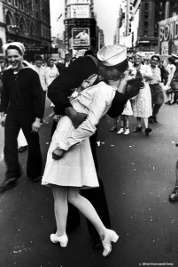
kiss-soldier-nurse-time-square

kissing the war goodbye

Contextual Information:

Artist – Alfred Eisenstaedt
Title – Kissing the War Goodbye / V-J Day In Times Square
Year of creation – August 14, 1945
Collection/source –
Medium – B&W film
Genre – Photography
Style – Art Nouveau
Image URL / origin – https://en.wikipedia.org/wiki/V-J_Day_in_Times_Square

Content – An American sailor kissing a nurse in New York Times Square as those in the surrounding parade celebrate the ending of the war. Those around them celebrate and are caught up in the moment unfolding in front of them.


Compositional Interpretation Analisys:

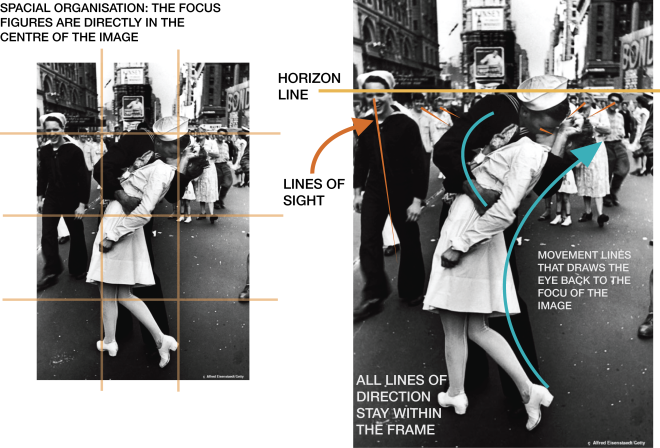
The focal point of this image is created by the kiss of the soldier and the nurse in the foreground, and is contrasted with the busy background of secondary figures that are slightly blurred. Every figure’s line of sight is directed towards the kissing people. There is distinct, joyous movement in the image, embodied mainly in the slight swing of the couple, creating a direction of eye-line that guides the viewer down the middle of the image.

The lighting of this image natural, and has created strong shadows and highlights that further draws attention to the focal point of the image. The nurse’s clothing and skin is almost completely white, as opposed to the dark clothes of the sailor.

The expressive content in this image is of joy and celebration; the way in which the two figures embrace in an unexpected celebratory kiss, and the happiness that can be seen in those around them that are witnessing.


Comparative Analysis:

Compositional Interpretation (Image Analysis) WK2

Semiotics: the Study Of Signs (WK3)

Semiotics is the study of symbols and signs in the context of visual conventions. It is the exploration of how words and other signs interact in order to create layers of meaning. Semiotics reveals the hidden meaning within images via the application of semiotic codes (rules) that connects  signs with their meanings. Semiotics is a system of visual communication established through the context of cultural and social structures. Through the recognition of power structures and stereotypes, the potential and intended meanings of an image can be understood. It is a theory that involves many different methods and theoretical understandings, mainly between natural signs (freely occurring throughout nature) and conventional signs (those designed precisely for the purpose of communication.  (Chandler, 2014).


References:

Chandler, D. (2014). Semiotics: Introduction. [online] Visual Memory. Available at: http://visual-memory.co.uk/daniel/Documents/S4B/sem01.html [Accessed 26 Aug. 2015].

Rose, Gillian (2001). Chapter 4: Semiology. In Gillian Rose, Visual Methodoligies: An Introduction to the Interpretation of Visual Materials, (pp.69 -00)

Semiotics: the Study Of Signs (WK3)

SEMIOTICS (IMAGE ANALYSIS)

Student name: Siyu Gong

Date of post: 26/08/2015

Topic and relevant lecture week: annotate image & semiotics analysis, week 3 lecture

未标题-111111111111111

Contextual information :

Type: Advertising

Photograph by: Hans Sipma

Title: McDonalds – Night Light – Open 24 Hours

Year of creation:  2010

Collection/source: McDonalds Creative Advertising

Technique: Photograph & Photoshop

Image URL /origin: http://istvanpinter.com/2010/03/mcdonalds-night-light/

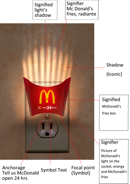
Content: This ad would like to express the concept of McDonald’s is open 24 hours, the idea is very creative , they use McDonald’s fries box to be light and plugged into the outlet, reflecting the shadow looks like McDonald’s fries.


Sign: The signified of this ad is McDonald’s fries, the signifier is light, energy and McDonald’s fries.

Icon- Icon is direct representation through apparent likeness. This ad obviously show the classic logo of McDonald, and put it in the middle position in order to make the customer easy  to realize this is McDonald’s ad.

Index- The indexes meaning of the signifier, there is an inherent relationship. In this ad, the indexs are light, energy and McDonald’s fries.

Symbol- The symbol in the ad are McDonald’s logo “M” and the text on the McDonald’s fries box.

Anchorage- The text of this ad is anchoring the meaning, it focus and direct lead viewer the way they interpret the image.

Relay- The text in this ad have a relationship with the McDonald’s fries box. People from the text can easy understand McDonald open 24 hours. A combination of images and text is the easiest way to let audience understand what McDonald wanted to express. Moreover, the iconic of this ad is the fries’ shadow.

SEMIOTICS (IMAGE ANALYSIS)

COMPOSITIONAL INTERPRETATION ( MOVING IMAGE SEQUENCE)

Student name: Siyu Gong

Date of post: 26/08/2015

Topic and relevant lecture week: annotate image & CI analysis, week 2 lecture

未标题-11111

Contextual information 1:

Title: About time

Type: Romantic comedy-drama film

Directed by: Richard Curtis

Year of creation:  2013

Collection/source:  Three frames in the movie

Technique: Filming

Style: Realism

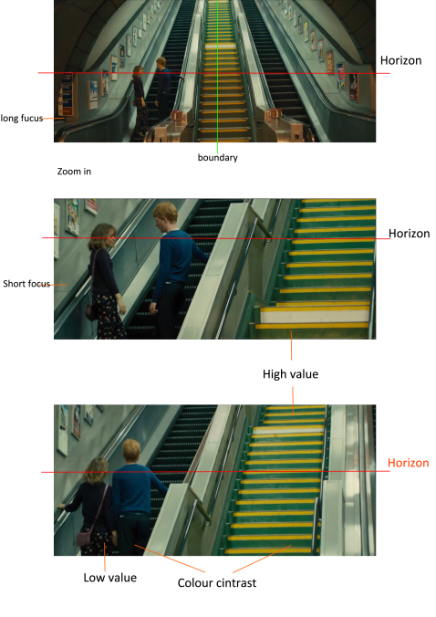
Content: This three frames selected the scene that two protagonists on the escalator. As can be seen from the screen this couple face to face have eye contact and at this time accompanied by film’s background music so that the screen give audience a warm and sweet feeling.


Analysis using Compositional Interpretation& Monaco’s syntax:

Colour analysis: The whole screen show a low value and with a low saturation. Two protagonists are dressed in dark clothes which is a low value, but the middle of the stairs is bright yellow colour which is a high value, there have a colour contrast between the elevator area  and yellow stair, and the yellow stair just like a dividing line.

Form/shape: The second and third frames has show a shape contrast, that’s mean lines direction of the movement in the composition and structure.

Light: The lighting  is from the top of the screen with arc-shaped and  warm hue. Both side is halo dark and the center is bright this lighting effects can bring audience a romantic feeling

Monaco’s syntax: The first frame shows a long shot, the audience can see the whole environment, with the lens closer, the audience’s attention focused on the two main characters, it belongs to a short shot. The screen of the third frame begin slowly zoom out, the lens slowly rising along with the movement of two protagonists. The horizon line level of these three frames all on the two protagonists. The scene along with the romantic background music and no dialogue between protagonist, let people feel a romantic atmosphere.

COMPOSITIONAL INTERPRETATION ( MOVING IMAGE SEQUENCE)

COMPOSITIONAL INTERPRETATION (IMAGE ANALYSIS)

Student name: Siyu Gong

Date of post: 26/08/2015

Topic and relevant lecture week: annotate image & CI analysis, week 2 lecture

未标题7-1

Contextual information 1:

Magazine: Vanityfair

Photograph by: Jason Bell

Title: Happy birthday, prince George!

Year of creation:  August, 2014

Collection/source: Vanityfair Magazine

Technique: Photograph

Style: Realism

Image URL /origin: http://www.huffingtonpost.co.uk/2014/08/14/prince-george-is-vanity-fair-s-cover-star_n_7326538.html

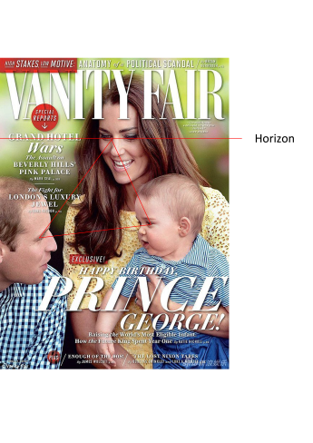
Content: The magazine chose the Prince George for the cover spot to mark his first birthday. The royal baby can be seen alongside his mother and father the Duke and Duchess of Cambridge on the front of the August issue.


Analysis using Compositional Interpretation:

Colour analysis: The whole image show a Green hue and with a high saturation. The photo shoot using a blurry dark green background in order to make audiences’ concentration on this royal family and Kate with yellow color clothes, this colour is a high value  colour, also can be the highlight. Therefore it can show a obvious luminance contrast between target and background.

Spatial organization: viewer can easy to see the connection between this three characters, because of their eye contact. The focaliser is on Kate’s eyes and the horizon line (the red line on the image) also on her eyes level. Following Kate’s eyes audience can focus on William and George. Moreover, the perspective line (the red triangle on the image)from their eyes can be a triangle. So viewer more focus on that space.

Light: The photographic show a natural daylight, make whole picture looks warm and comfortable.

Expressive content: photographer caught the natural smile of this royal family, displaying a harmonious and warm picture, make people feel the happiness from their expression.

COMPOSITIONAL INTERPRETATION (IMAGE ANALYSIS)

COMPOSITIONAL INTERPRETATION (IMAGE ANALYSIS)

Student name: Siyu Gong

Date of post: 07/08/2015

Topic and relevant lecture week: annotate image & CI analysis, week 2 lecture

The Nut Gatherers

Contextual information 1:

Artist: William-Adolphe Bouguereau

Title: The nut gatherers

Year of creation: 1882

Dimensions: 134 x 87.5 cm

Collection/source: Detroit Institute of Arts, Detroit, MI, USA

Technique, material: Oil

Genre: Genre painting

Style: Neoclassicism

Image URL /origin:

http://www.wikiart.org/en/Search/the%20nut%20gatherers#supersized-search-232520

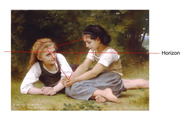
Content: These two young girls are relaxing in a beautiful, natural environment. From the painting It can be seen that one girl with gold hair and one girl with black hair they are communicate with each other, their pure and innocent face looks really enjoyed each other’s company.


Analysis using Compositional Interpretation:

Colour analysis: The whole image show a yellow hue and with a low saturation. The background of the tree is low value  and two girls with white color clothes is high value also can be the highlight. Therefore it can show a obvious luminance contrast between target and background.

Spatial organization: viewer can see the connection between this two girls, such as posture, eye contact etc. The focaliser is on gold hair girl’s eyes and the horizon line  (the red line on the image) also on that level. Moreover, the perspective line (the red triangle on the image)from left girl’s eyes to right girl’s eyes to right girl’s hand, the structure can be a triangle. So viewer more focus on that space.

Light: The draw show a natural daylight, make whole picture looks warm and comfortable.

Expressive content:  Both of two girls are barefooted it represents relax and freedom. The whole picture brings a sense of serenity and comfortable to the viewer.

COMPOSITIONAL INTERPRETATION (IMAGE ANALYSIS)

Compositional Interpretation (Image Sequence)

Student name: Jess Vandersande n9168214

Date of post:  8/5/2015

Topic/relevant lecture week: CI Analysis & Image Annotation (WEEK 2 LECTURE)


Image Sequence (1) Image Sequence (2)Image Sequence (3)

JP

Contextual Information:

Director: Steven Spielberg

Title: Jurassic Park

Year of creation: 1993

Typemovie still

Genre:

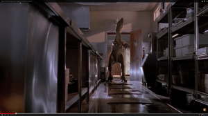
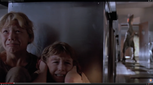
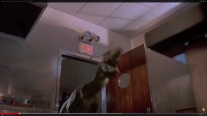
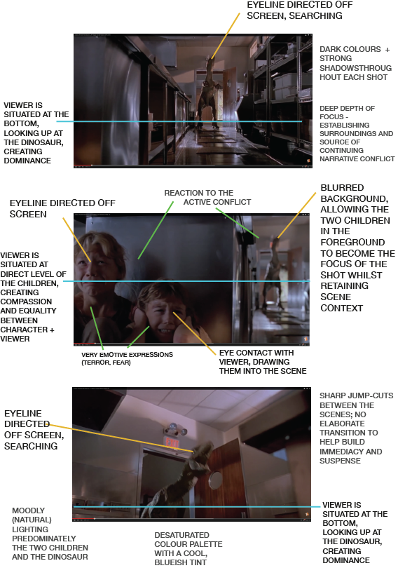
Content: Scene of a hide-and-seek type action sequence consisting of two children hiding in an industrial kitchen from an escaped velociraptor. The children appear terrified, and the raptor is closing in on its prey.


CI Analysis:

The colours in this scene consist of a limited palettes of blues, blacks and purples, balanced with a high contrast (seen in the dark shadows and dramatic highlights) and a lower saturation that draws attention to the almost monochromatic colouring. The pallet does not once stray from the cool hue; even the usually bright red ‘exit’ sign has been dulled to its surroundings.

The lighting used in this scene is quite particular. Each shot is very dark, with slight illumination sourced from natural light. The lighting is overall quite dull, but is utilised in such a way that only the focus figures (velociraptor, two children) are highlighted. The surroundings of the kitchen are visible, but they are noticed only briefly before attention is quickly directed towards the interactions between the moving characters. The figures are often semi-illumintated, leaving the remainder of their facial expressions/figures bathed in shadows.

The spacial organisation of these scenes shifts quickly between deep field of view shots focusing on the raptor, and then intimate, cropped shots of the hiding children with the raptor blurred in the background.


In regards to Monaco’s syntax, the strongest elements of these shots is balanced between the immersive POV camera angles that the scenes move between, and the [lack of] use of dialogue, focussing mainly on the dominating sounds of the raptor and the desperate cries of the children against the suspenseful music in the background.

The first still holds a POV angle that places the viewer almost underneath the raptor, creating a mood of power and dominance over both the viewer and the children that it is hunting. The POV then changes in the second shot, putting the viewer at direct eye-line with the hiding children, drawing the viewer into the scene.

The quick jump-cut editing between scenes is very effective in increasing the tension, jumping back and forth between the dinosaur and the children.

Compositional Interpretation (Image Sequence)